“There’s no doubt, New Yorkers are as savvy as they come. They know which subway car to stand in to make the quickest exit at their stop, and they can micro-navigate a cabbie’s route turn-by-turn…[but] we found that even lifelong New Yorkers can get turned around the first time they hit the street outside an unfamiliar subway station, or building, or just while exploring a new neighborhood for the first time.”
That’s Janette Sadik-Khan. She’s the Department of Transportation(DOT) Commissioner for New York City. Her job is to learn seemingly paradoxical stats--like that 33% of NYers can’t find north--andimplement solutions to fix them. In this case, the DOT teamed up withPentagram, CityID, Billings Jackson Design, RBA Group, and T-Kartorto create WalkNYC, a new line of street maps targeted specifically at assisting the city’s pedestrians.
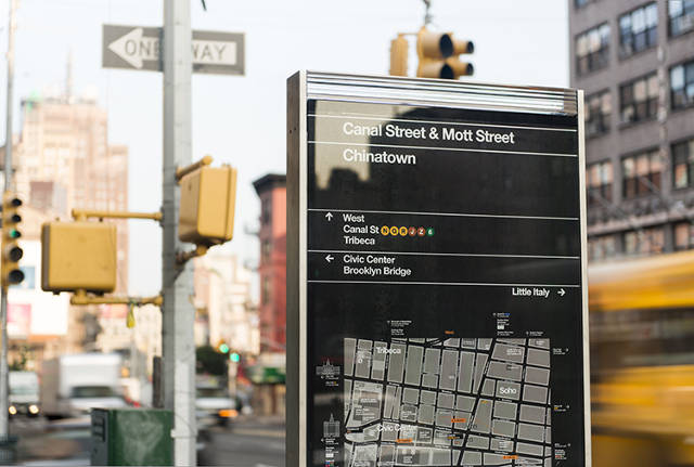
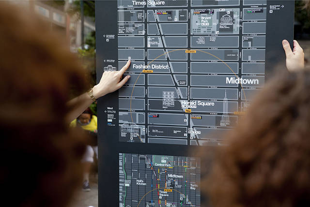
The maps’ most notable feature is certainly their perspective. While most public maps always depict north as being up, WalkNYC maps are oriented in the direction a user is facing, just like the first-person view of a GPS. Given that these signs each have two sides, that means the maps aren’t merely duplicated--they’re flipped to match the very specific way you’d be facing to read them.
“Orienting yourself on a static, north-oriented map is difficult when you’re not oriented yourself--which is likely why you’re looking at a map in the first place,” Sadik-Khan explains, adding that this quasi-GPS approach has already worked in cities like London.
To brand the maps as unmistakably New York, however, the signs would need more than a savvy perspective. Pentagram created a base color palette of greys, greens, and a soft-yet-distinctive yellow inspired by the city itself.
“It’s meant to evoke the glass, steel, and concrete character of New York,” explains Pentagram Partner Michael Bierut. “I have a secret aversion to maps with pretty colors for no good reason. These [maps] aren’t decoration, they’re information.”
Monotype created a new version of Helvetica (famously used in NYC’s subway stops) called Neue Helvetica DOT. Its most easily noted distinction would be its rounded dot, an obvious play on words that references the fact that Helvetica’s dots are usually squares. From this typeface, Pentagram created a set of icons for services like bathrooms, hospitals, and transportation, mirroring curves in the lettering to construct the images.
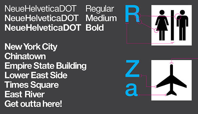
“Obviously, this was a subtle thing that we don’t expect civilians to notice or care about,” Bierut says. “We did want the icons to seem like a direct extension of the typography, rather than another unrelated element. We were extremely conscious of the fact that we were packing an enormous amount of information into a limited area. By reducing every point of dissonance possible, I think we ended up with a more harmonious result.”
Ultimately, some may see the WalkNYC signs as relatively old school--they won’t glow, beep, or respond to your touch--but that doesn’t mean the signs are stuck in yesteryear. From their pedestrian-centric perspective to their smallest decisions of print design, WalkNYC has been designed to make native NYers feel more welcome in their own town. (And it doesn’t exactly hurt for all of us tourists, either.)


No hay comentarios:
Publicar un comentario