THE SELF-PROCLAIMED "SUPERGRAPHICS" DESIGNER HAS DIED AT AGE 83.
Deborah Sussman, the designer best known for creating the environmental graphics of the 1984 Summer Olympics in Los Angeles, died yesterday after a long battle with cancer. She was 83.
Sussman often characterized her own work as "supergraphics:" large-scale, brightly colored designs that shaped the built environment and brought the urban landscape to life often more powerfully than architecture itself. "The idea of supergraphics was not that it was just ‘big' but that it was ‘bigger' than the architecture," she said in a 2013 interview with Creative Review. "It didn't have to fit in to prescribed spaces in a traditional way. It could have its own life and go beyond the ceiling, be cropped, be as though it had almost flown over the architecture." That might mean a giant orange star planted on top of a building at the Olympic Arts Festival, or a massive yellow-and-orange X installed on the wall of a department store. The approach has now become mainstream, but in Sussman's time, it was pioneering.
Born in Brooklyn in 1931, Sussman took classes at the Art Students League in Manhattan and studied acting and painting at Bard College. She later graduated with a degree in graphic design from Chicago’s Institute of Design, then run by Bauhaus painter and photographerLászló Moholy-Nagy. Her professional career started at age 22, in 1953, in the offices of Charles and Ray Eames, where she worked on seminalexhibits for IBM (at the 1964 World's Fair), the government of India, and the Ford Foundation before winning a Fulbright Scholarship to study at the Hochschule für Gestaltang, an art and design school in Ulm, Germany.
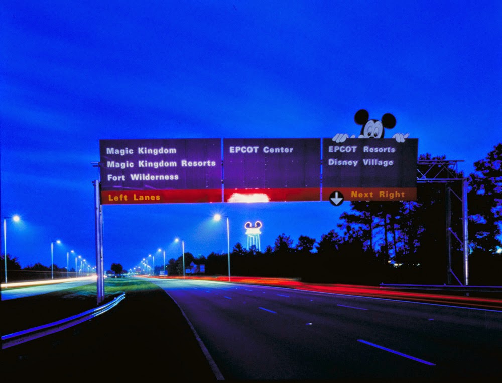
In 1968, she opened her own design practice, and in 1980, she was joined by her husband, urban planner and architect Paul Prezja, in creating Sussman/Prejza & Company. Their “urban branding” projects included city identities for Philadelphia and Santa Monica, as well as wayfinding systems for Walt Disney Resorts and interiors for Hasbro, Inc. She was the first woman to exhibit in New York’s School of Visual Arts’ “Master Series," and in 2004, won the prestigious American Institute of Graphic Arts Medal.
Sussman was part of a design team that worked on the 1984 Summer Olympics, one of the best examples of her "supergraphics." The team created bold, brightly colored "pop-up" towers, gateways, and walls made from inexpensive scaffolding, upcycled tents, nylon banners, and canopies--cheap replacements for permanent buildings that would be used for the Games, then never again. Instead of the expected national hues of red, white, and blue, the designs were rendered in hot magenta, vermillion, aqua, and chrome yellow, channeling the sun-drenched color palette of Los Angeles and the Pacific Rim. The designs incorporated "pictures of those huge papier-mâché figures made in Asia and Mexico which go up in flames, and bamboo for the scaffolding," Sussman told Creative Review, capturing these cultures' unique "technologies of celebration." "More is more," she sometimes liked to say.
“Several people have told me over the years ‘just give them what they want’ with regards to clients, and I can’t bring myself to do it,” Sussman said in a 2013 interview with Designboom. "I have to inspire them, and that can sometimes be a very dangerous attitude to have because you can lose yourself a lot of money."
Below, a video interview with Sussman, wearing her trademark spectacles, by the Los Angeles Contemporary Art Museum.


Source: http://www.fastcodesign.com/3034682/fast-feed/rip-deborah-sussman-who-made-graphic-design-larger-than-life?utm_source=mailchimp&utm_medium=email&utm_campaign=codesign-daily&position=2&partner=newsletter#1


No hay comentarios:
Publicar un comentario